Brief
An engineering analysis company required a new logo design to coincide with a new website. The identity had to be distinctive and modern.
An engineering analysis company required a new logo design to coincide with a new website. The identity had to be distinctive and modern.
Solution
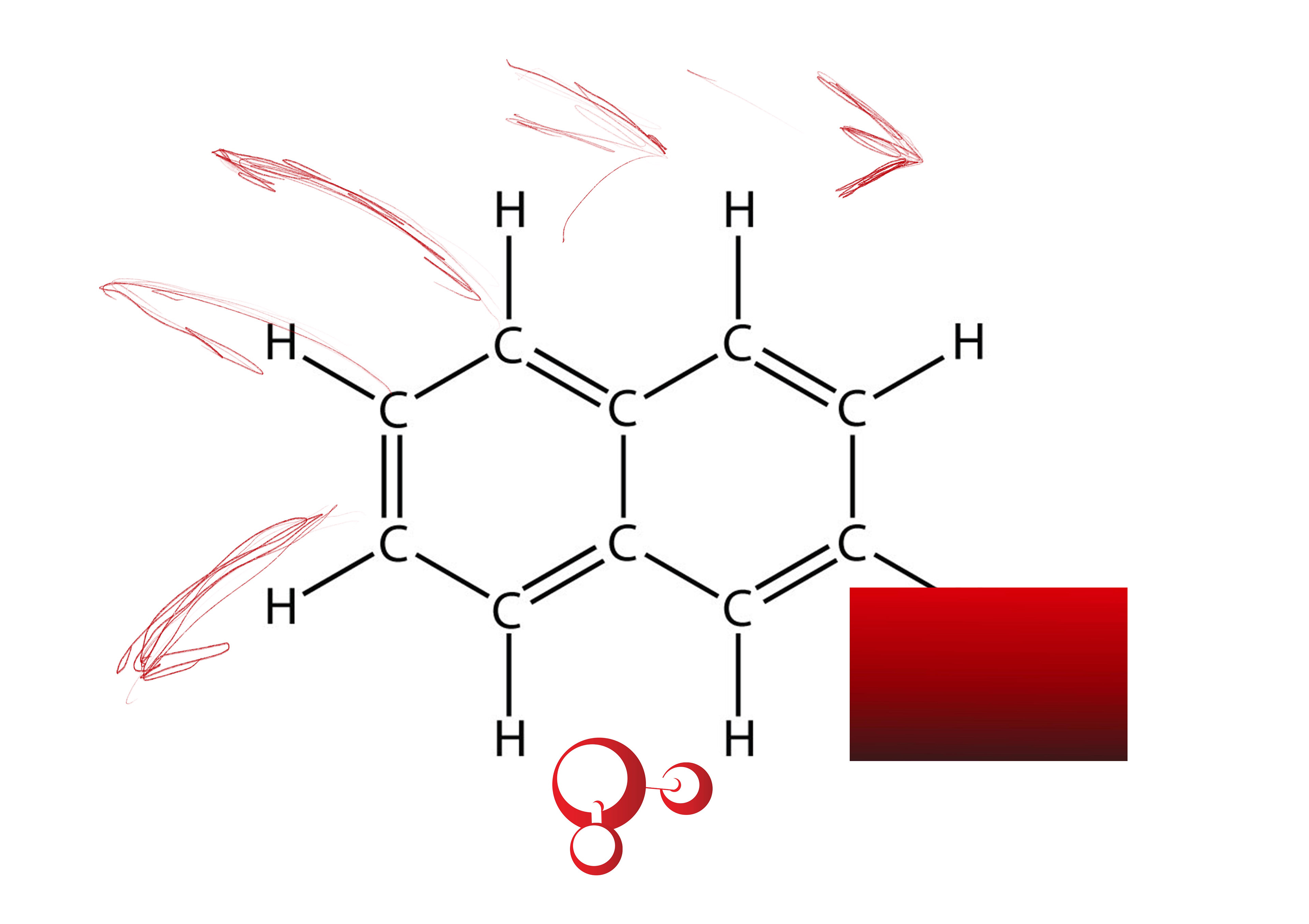
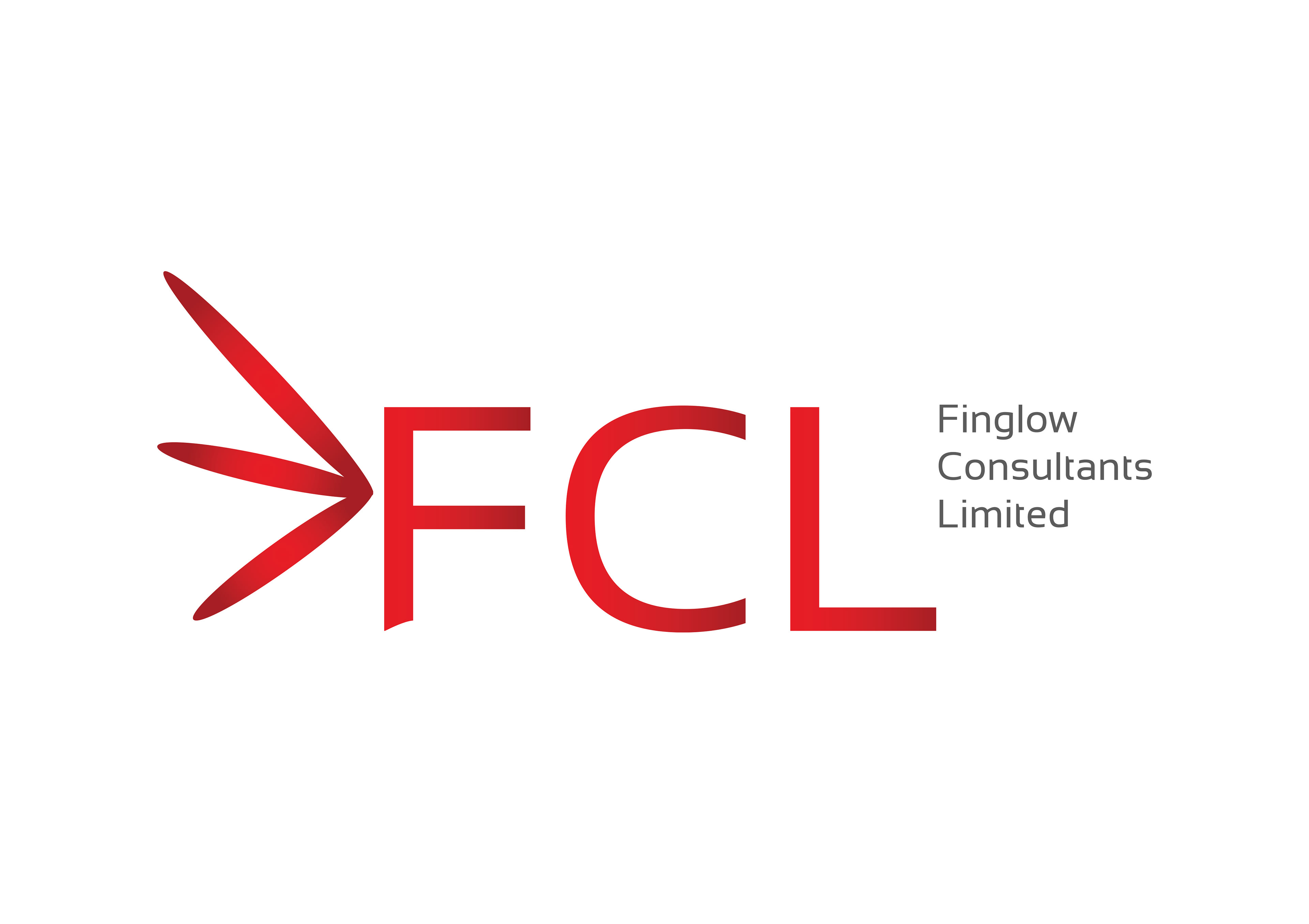
A clean, elegant typography with dark and light red gradient, and full company title in grey. A stylised arrow head, inspired by the shapes of hydrocarbons, forms a graphic element helps underpin a contemporary image whilst the more curved form synthesises well with curved shapes in the new website design.
A clean, elegant typography with dark and light red gradient, and full company title in grey. A stylised arrow head, inspired by the shapes of hydrocarbons, forms a graphic element helps underpin a contemporary image whilst the more curved form synthesises well with curved shapes in the new website design.