Brief
A local Church fellowship group wanted a visual identity to help communicate their work. The logo needed to make direct reference to the biblical verse Matthew 18:20, to underpin the groups ethos. The brand had to be black and white to allow for easy and economical printing.
A local Church fellowship group wanted a visual identity to help communicate their work. The logo needed to make direct reference to the biblical verse Matthew 18:20, to underpin the groups ethos. The brand had to be black and white to allow for easy and economical printing.
Solution
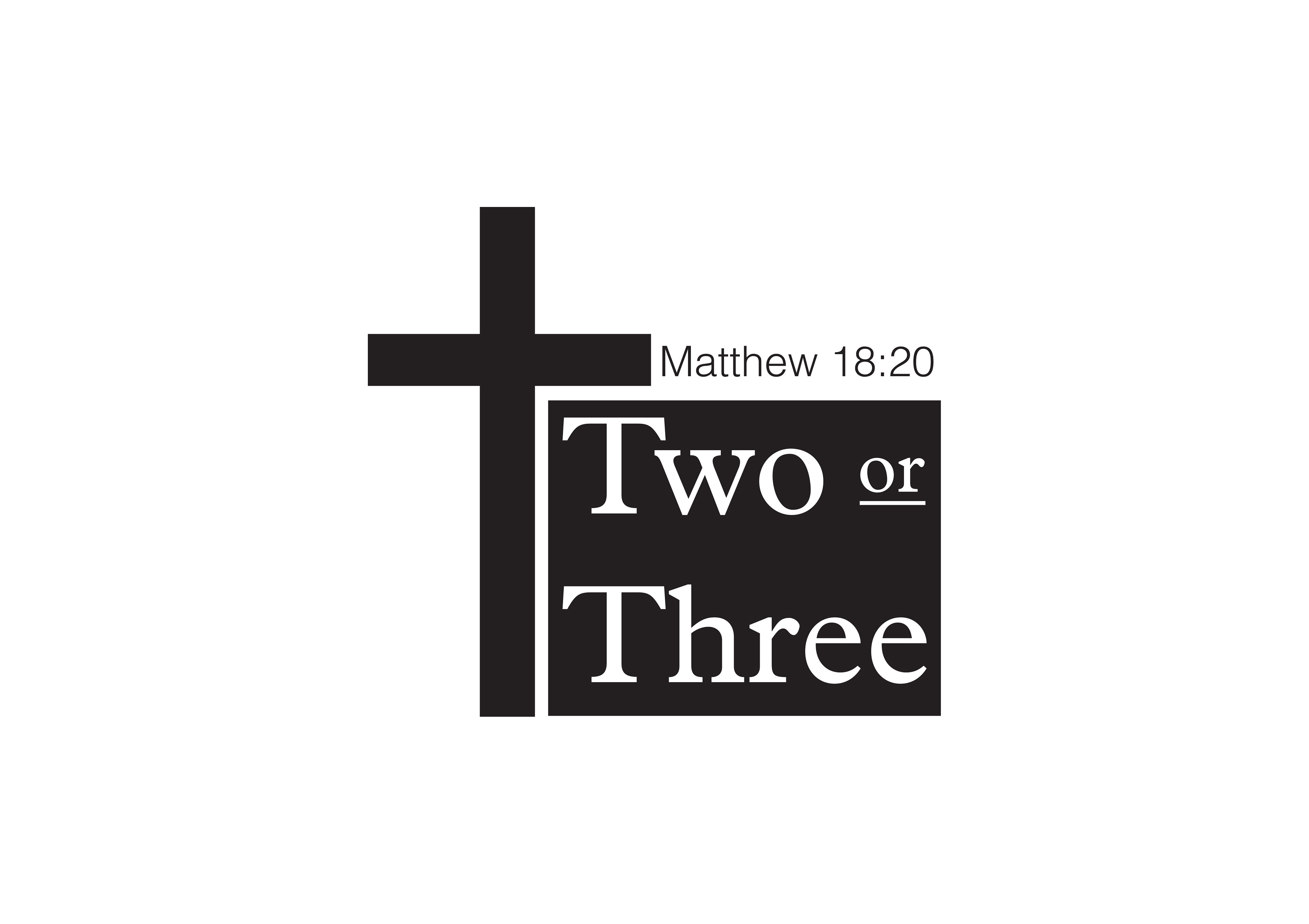
A text logo now enclosed in square and colour inverted to form a block. Crucifix forms main logo element, with Matthew verse in modern font along top.
A text logo now enclosed in square and colour inverted to form a block. Crucifix forms main logo element, with Matthew verse in modern font along top.