Brief
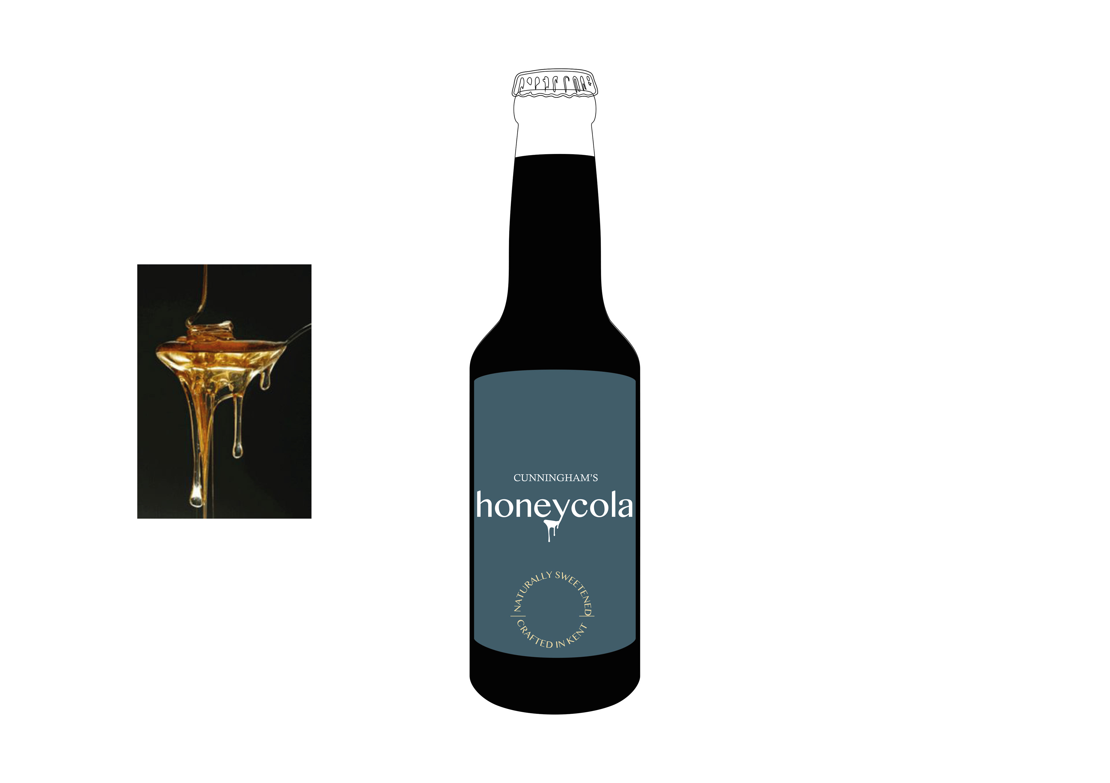
A Kent-based soft drink start-up wanted a distinctive logo for their unique cola product, sweetened entirely by local honey.
A Kent-based soft drink start-up wanted a distinctive logo for their unique cola product, sweetened entirely by local honey.
Solution
The "Y" on the simplistic type-based logo forms a convenient spoon for dripping honey, to accentuate the unique properties of the product inside. A gunmetal grey, white and light yellow colour-way were selected to highlight the brand's unique proposition as a maker of handcrafted soft drinks.
The "Y" on the simplistic type-based logo forms a convenient spoon for dripping honey, to accentuate the unique properties of the product inside. A gunmetal grey, white and light yellow colour-way were selected to highlight the brand's unique proposition as a maker of handcrafted soft drinks.