Brief
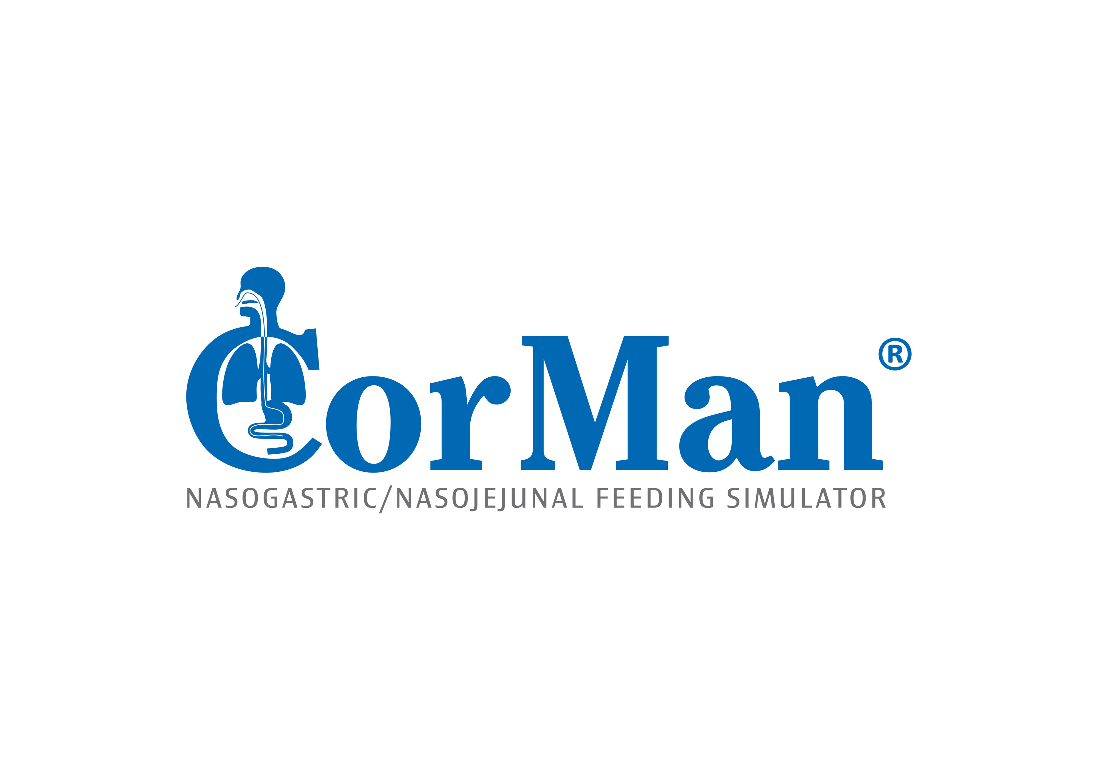
A product logo for a new medical education tool, teaching nurses how to insert nasogastric feeding tubes into patients. The logo needed to be distinctive but also communicate very clearly the product's intended use.
A product logo for a new medical education tool, teaching nurses how to insert nasogastric feeding tubes into patients. The logo needed to be distinctive but also communicate very clearly the product's intended use.
Solution
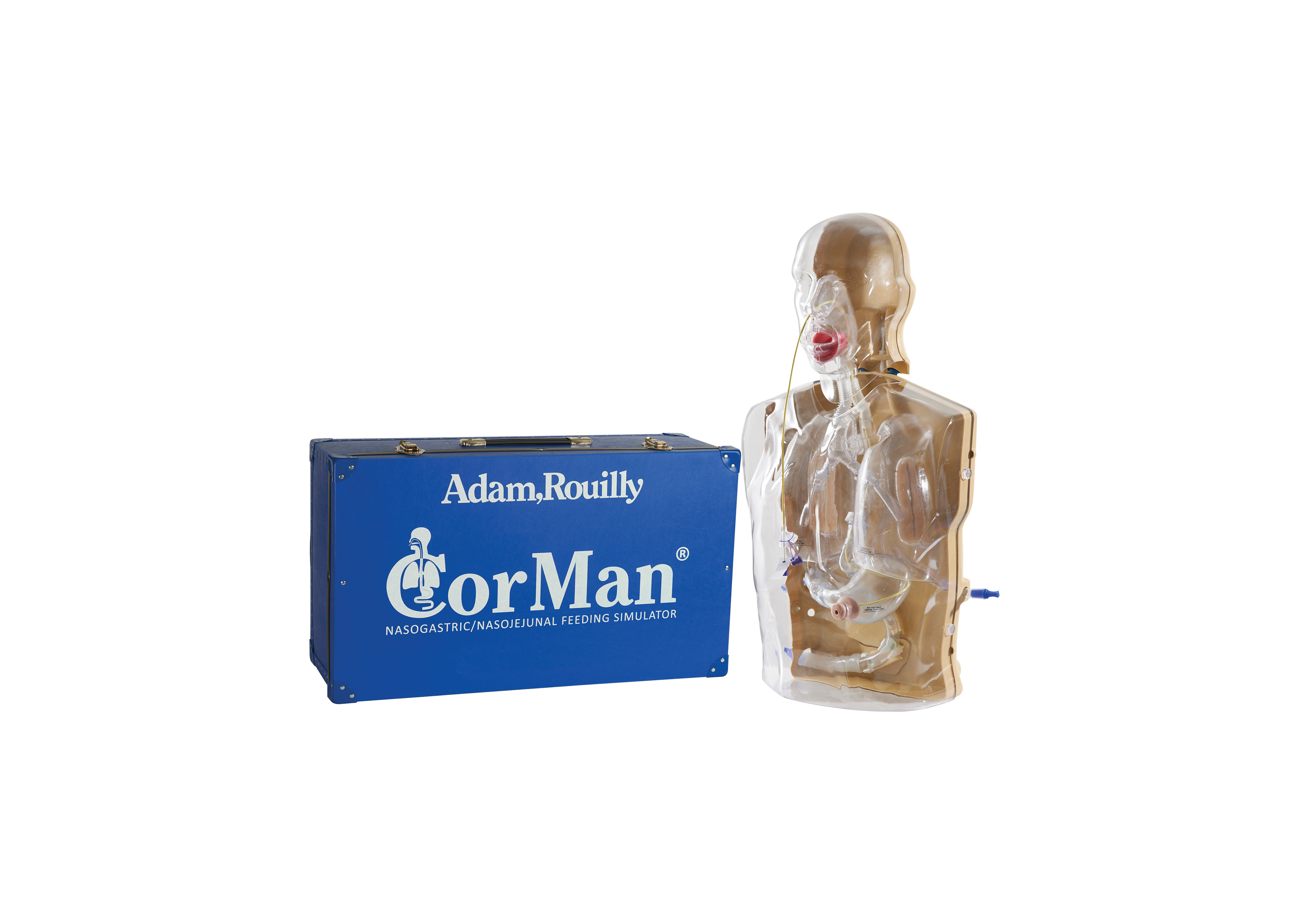
A graphic and text based logo utilising the company's preferred corporate font. The logo's starting letter "C" formed the basis of the graphical depiction of the medical procedure, with a feeding tube passing through the patient's nose, down the oesophagus and into the stomach. The product has become highly successful, cementing this visual identity as an industry leader.
A graphic and text based logo utilising the company's preferred corporate font. The logo's starting letter "C" formed the basis of the graphical depiction of the medical procedure, with a feeding tube passing through the patient's nose, down the oesophagus and into the stomach. The product has become highly successful, cementing this visual identity as an industry leader.