Brief
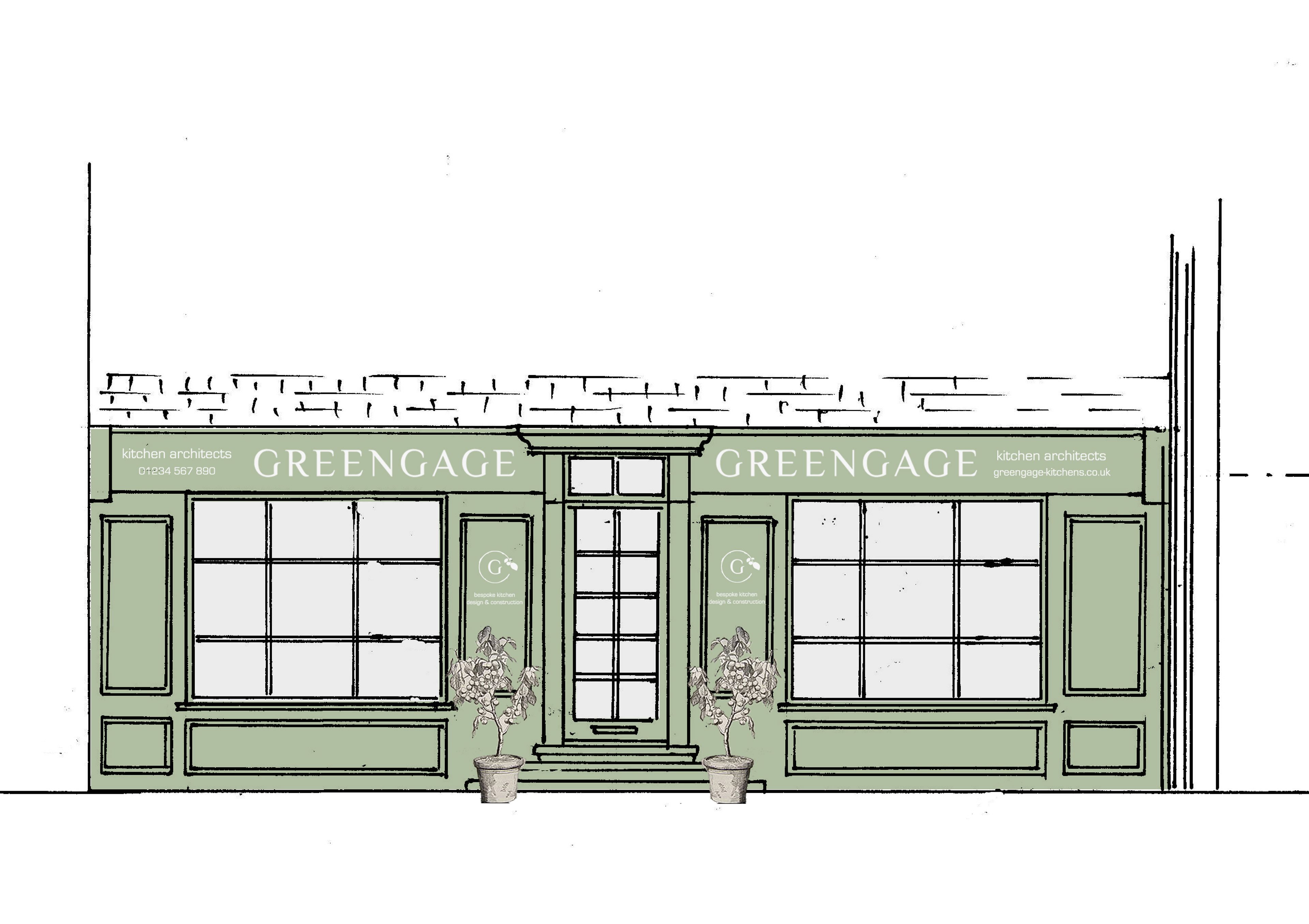
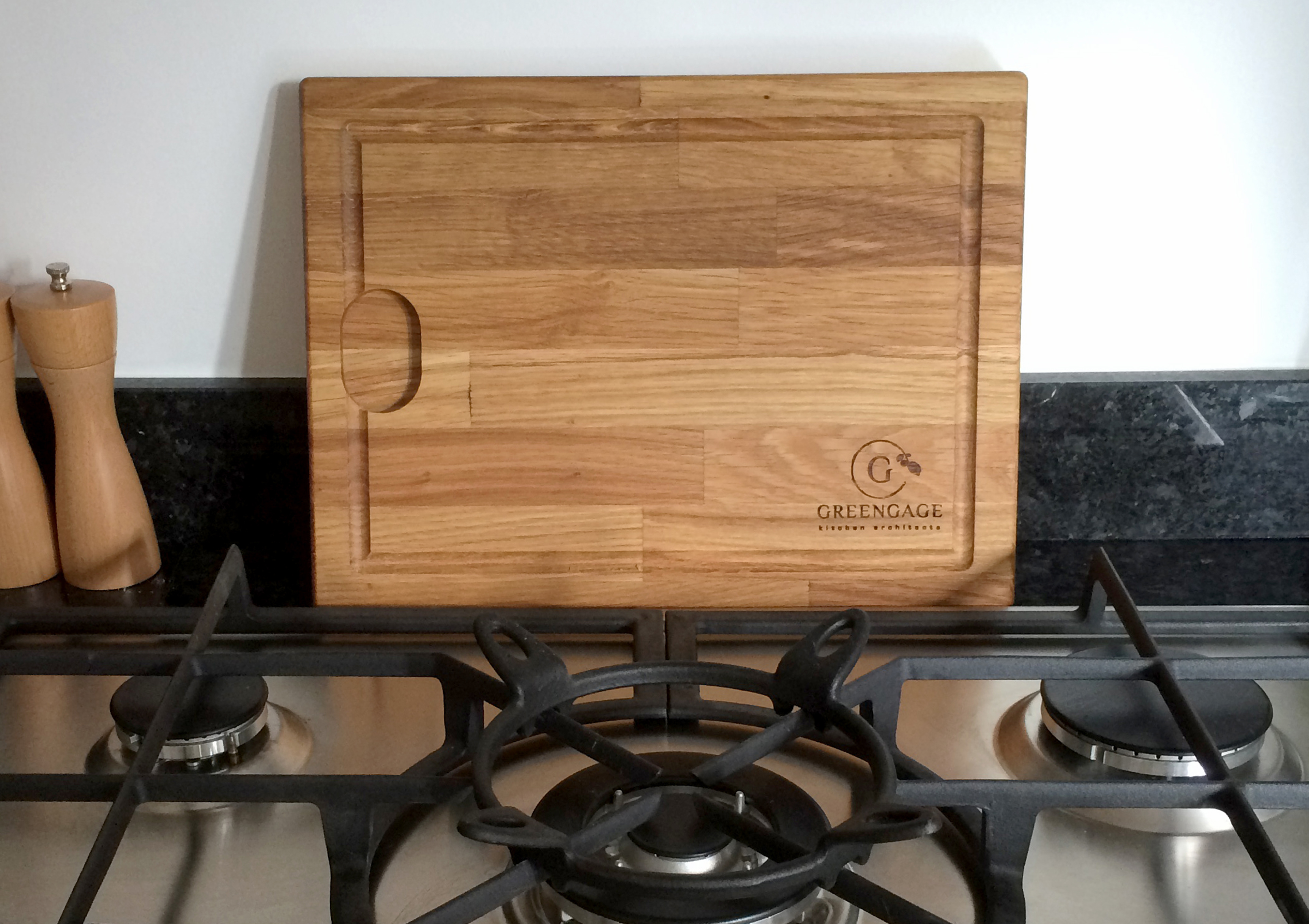
A new, Kent-based luxury kitchen design company wanted a visual identity to connect with its audience. The logo needed to translate easily from shop front, van- even chopping boards!
A new, Kent-based luxury kitchen design company wanted a visual identity to connect with its audience. The logo needed to translate easily from shop front, van- even chopping boards!
Solution
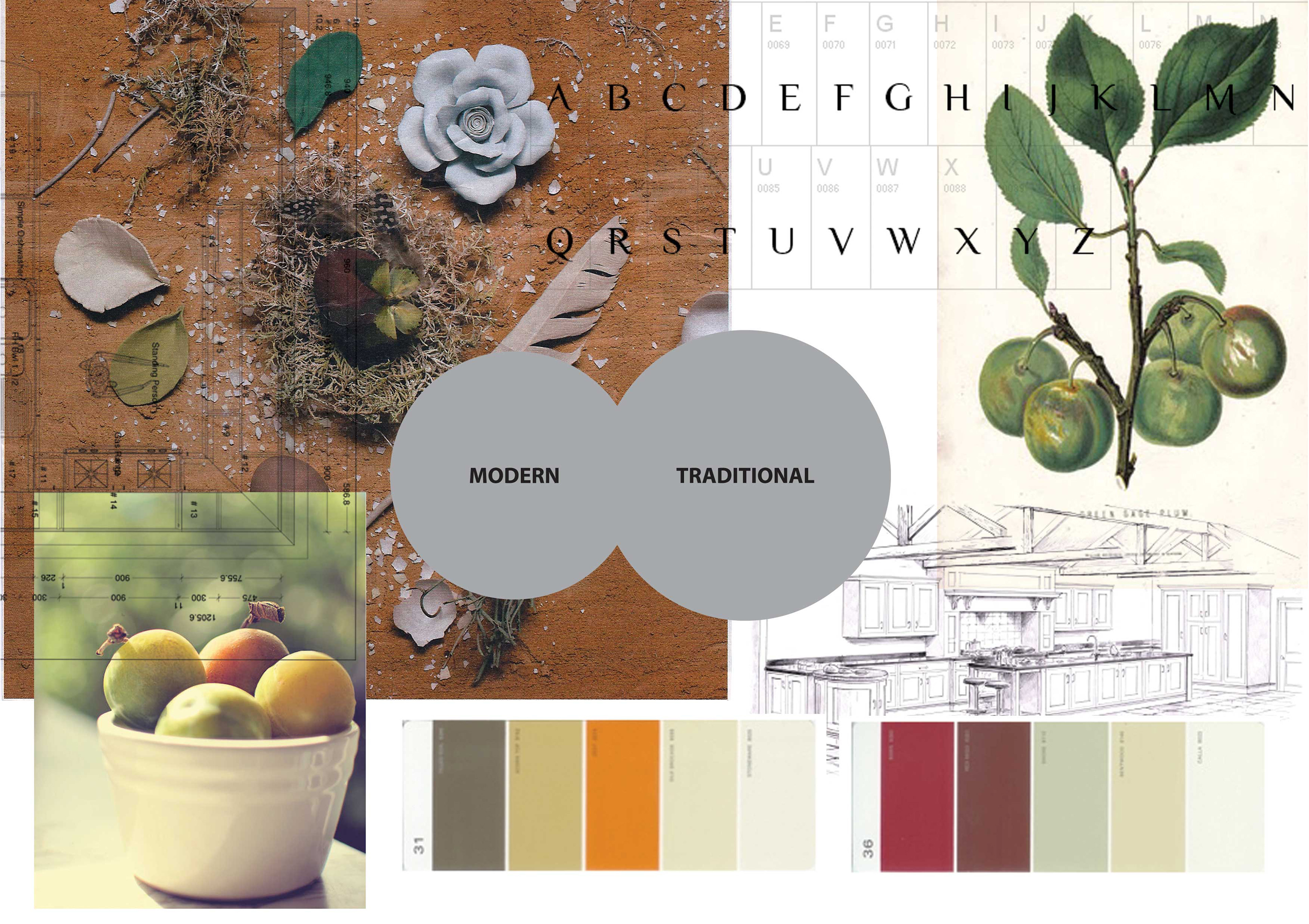
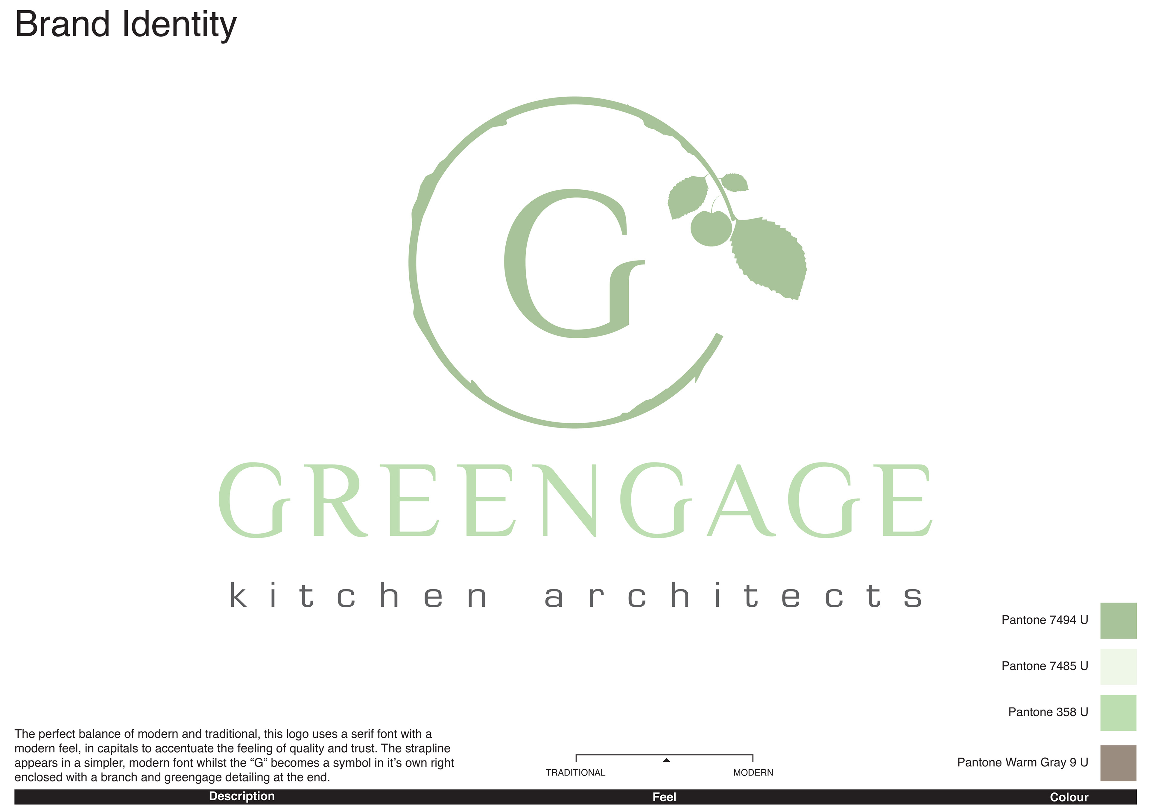
Ochre and earthen colours were selected to help underpin the hand crafted, luxury feel of the brand. A combination of both serif and sanserif fonts were used for the logo and tagline respectively, while a stylsed "G" forms a decorative logo element, forming a leafy branch with a ripe greengage on the end.
Ochre and earthen colours were selected to help underpin the hand crafted, luxury feel of the brand. A combination of both serif and sanserif fonts were used for the logo and tagline respectively, while a stylsed "G" forms a decorative logo element, forming a leafy branch with a ripe greengage on the end.